
RYE Properties - Brand Identity
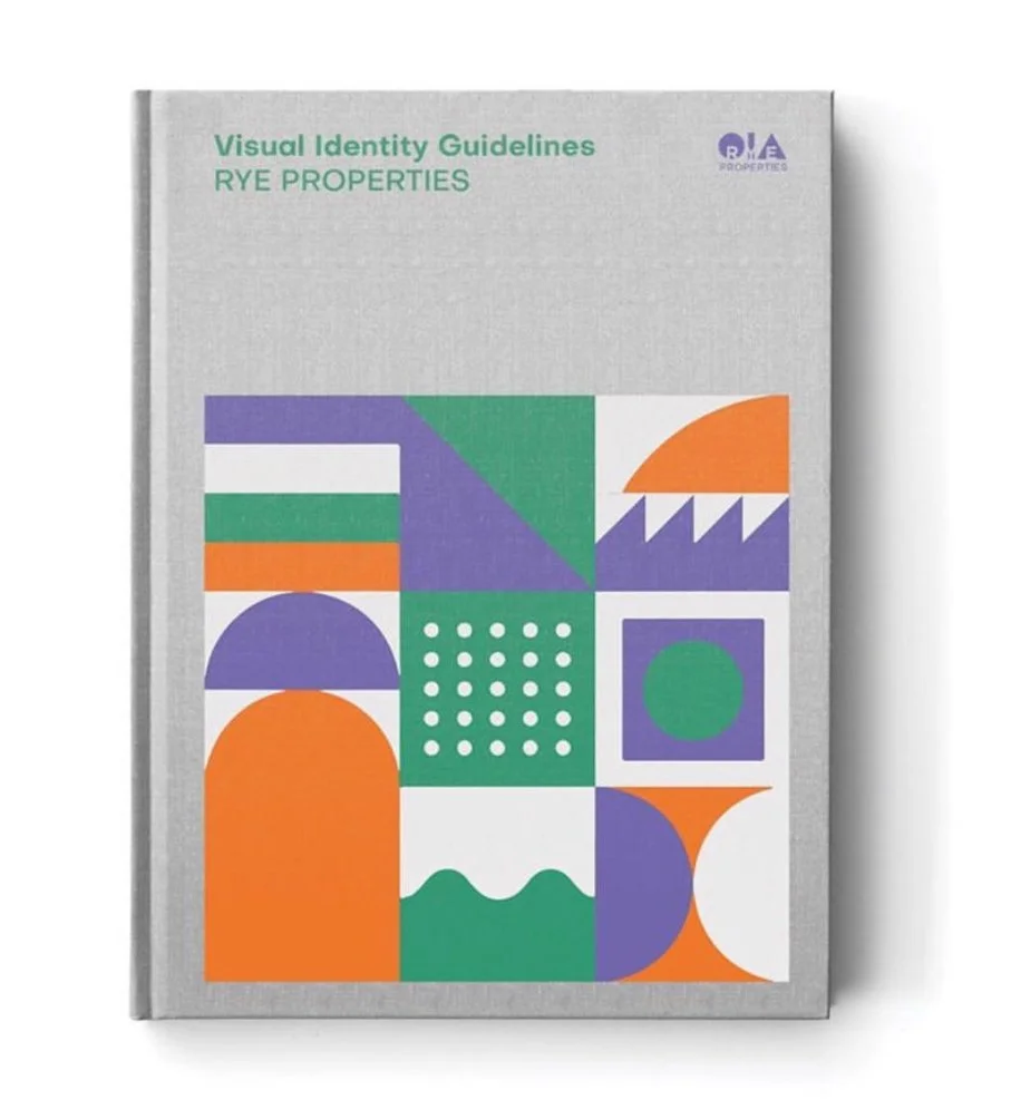
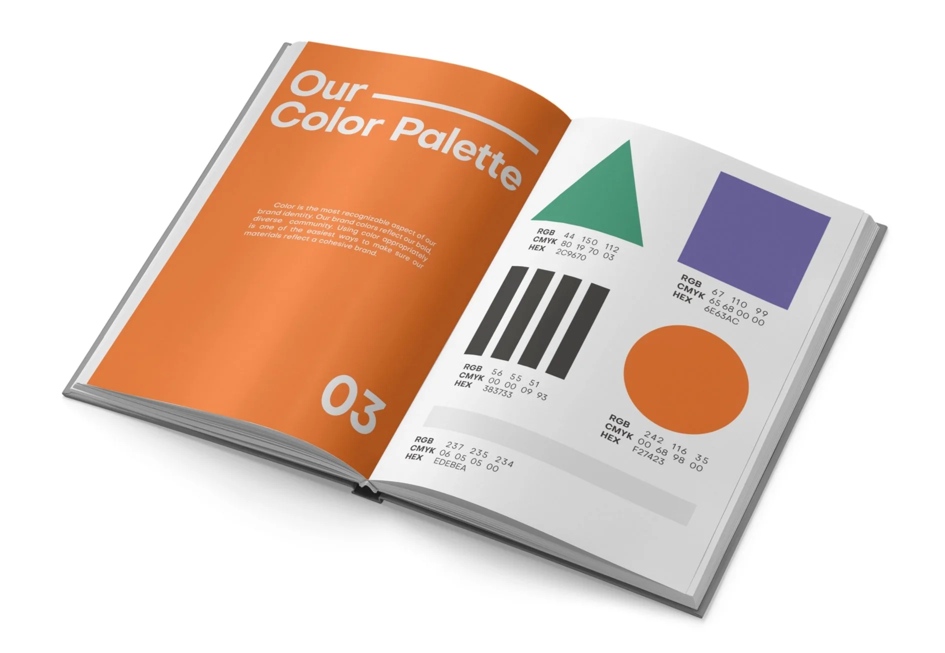
In 2019, embracing my freelance era, I developed a comprehensive brand identity for Rye Properties, a real estate company in Puerto Rico, specializing in customer service. The logo design is a modern and elegant representation of the initials R and E of the founders. The geometric shapes are carefully balanced by the central "Y," creating a visually striking and memorable mark. The color palette, including green, violet, orange, and white, symbolizes diversity, growth, and vitality.
The logo combines geometric lines with a modern and elegant typeface, creating a professional and trustworthy image. The business cards and stationery reflect this identity, using high-quality materials to convey a sense of professionalism and trust. The use of white space and refined typography enhances the brand's sophistication, while the vibrant color palette adds a touch of modernity and dynamism.


In addition to the logo and stationery, I also designed the visual identity guidelines to ensure consistent application across all brand materials. This cohesive visual identity effectively communicates Rye Properties' commitment to excellence. Every design element was carefully selected to reflect the company's values and its focus on providing high-quality services.

N Studio
Year: 2019
Logo Design | Brand Identity | Visual Identity Guideline