Solsoller | Branding
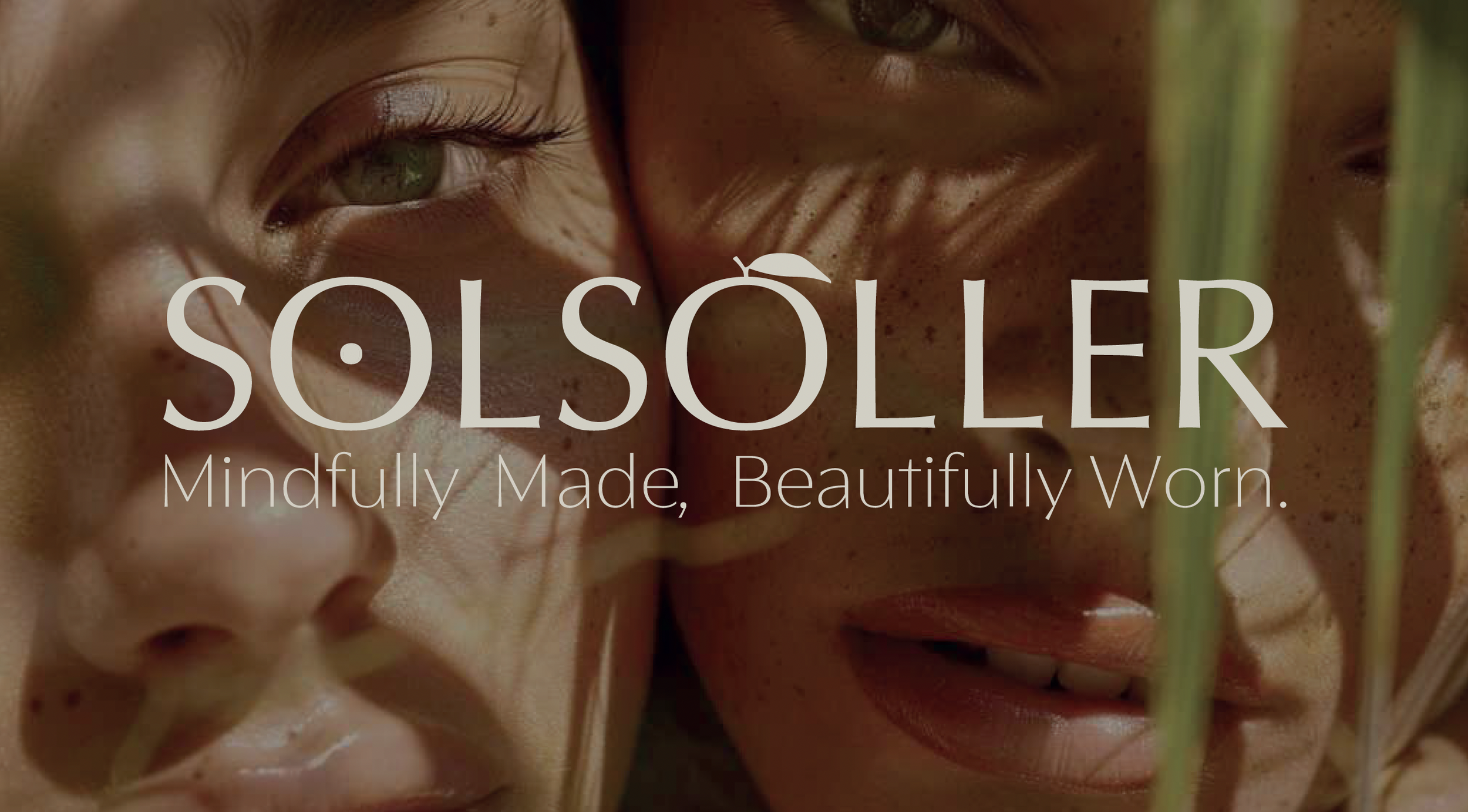
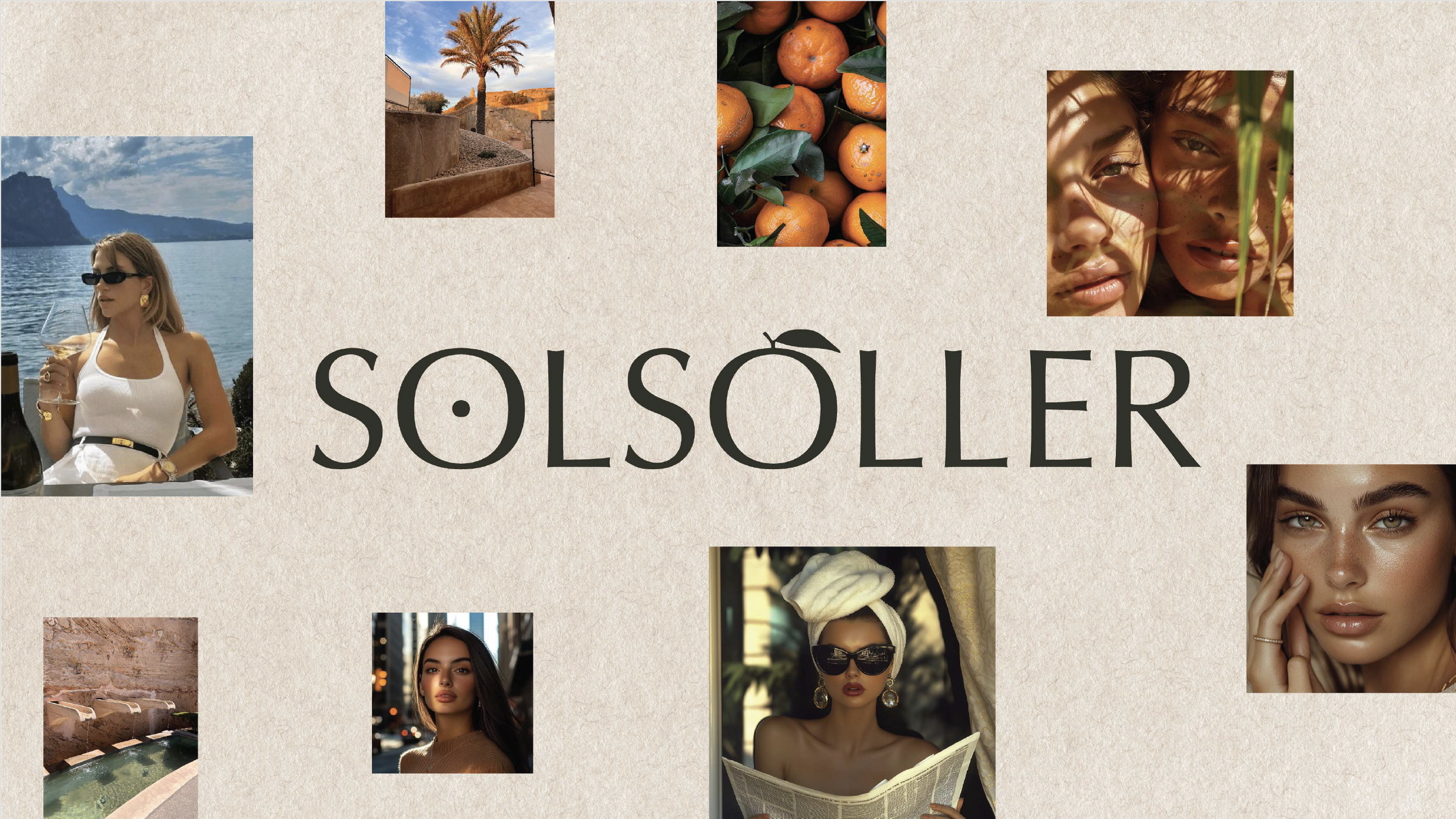
Solsoller is a contemporary skincare and makeup house inspired by the luminous cultural landscape of the Soller valley in Mallorca. Founded by Nanette Rickenbach, the brand was conceived as a refined intersection between scientific formulation, aesthetic sensibility and the Mediterranean philosophy of ritualized beauty.
The valley of Soller, historically known for its citrus orchards, radiant sunlight and proximity to the sea, became the conceptual foundation of the brand. Within this landscape, the mandarin orange emerged as a natural metaphor for vitality, origin and the quiet elegance associated with Mediterranean living.
N Studio was commissioned to develop the complete strategic and visual identity of the brand, translating this conceptual territory into a coherent design system capable of operating across product, packaging, editorial communication and digital environments.
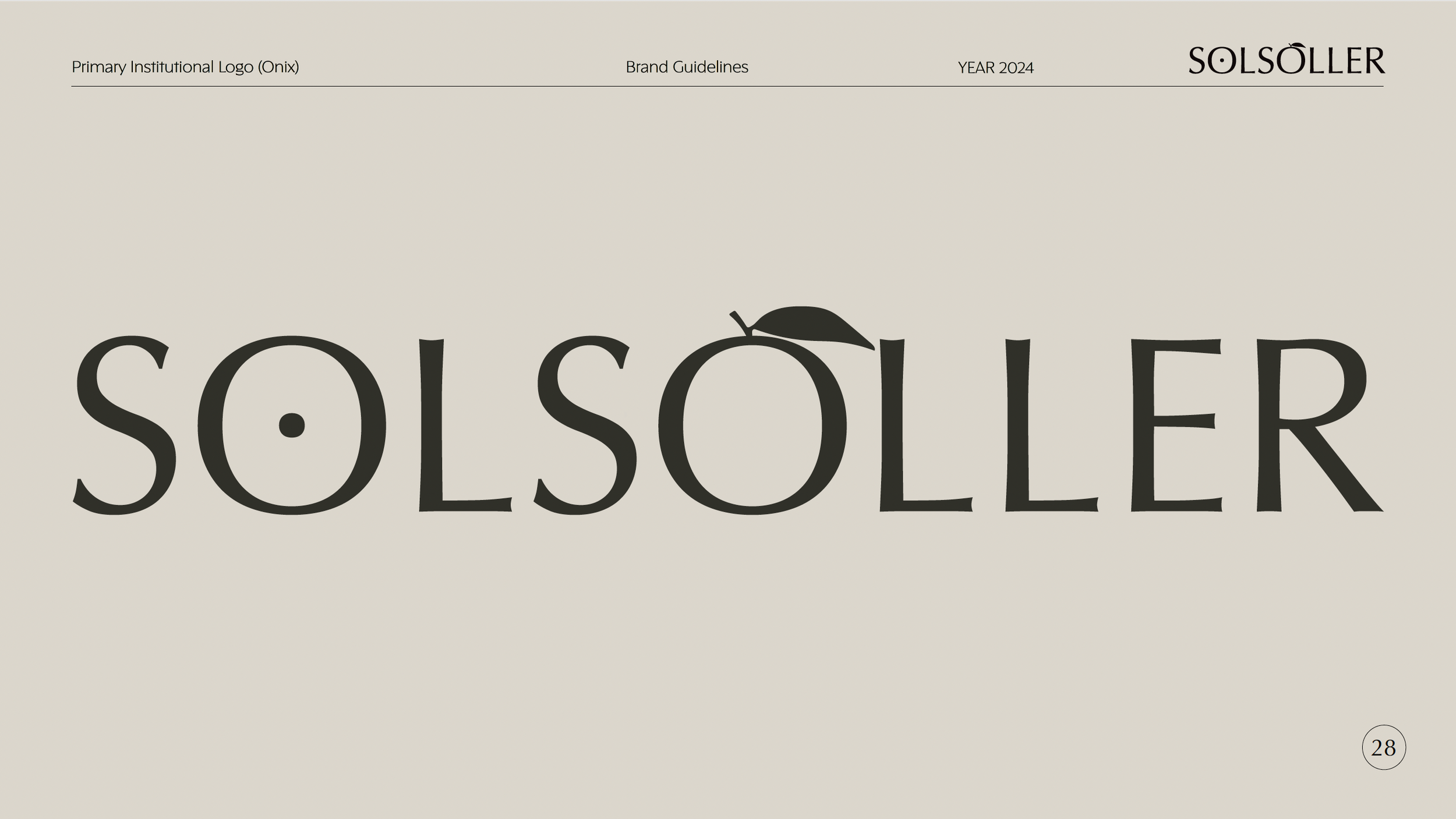
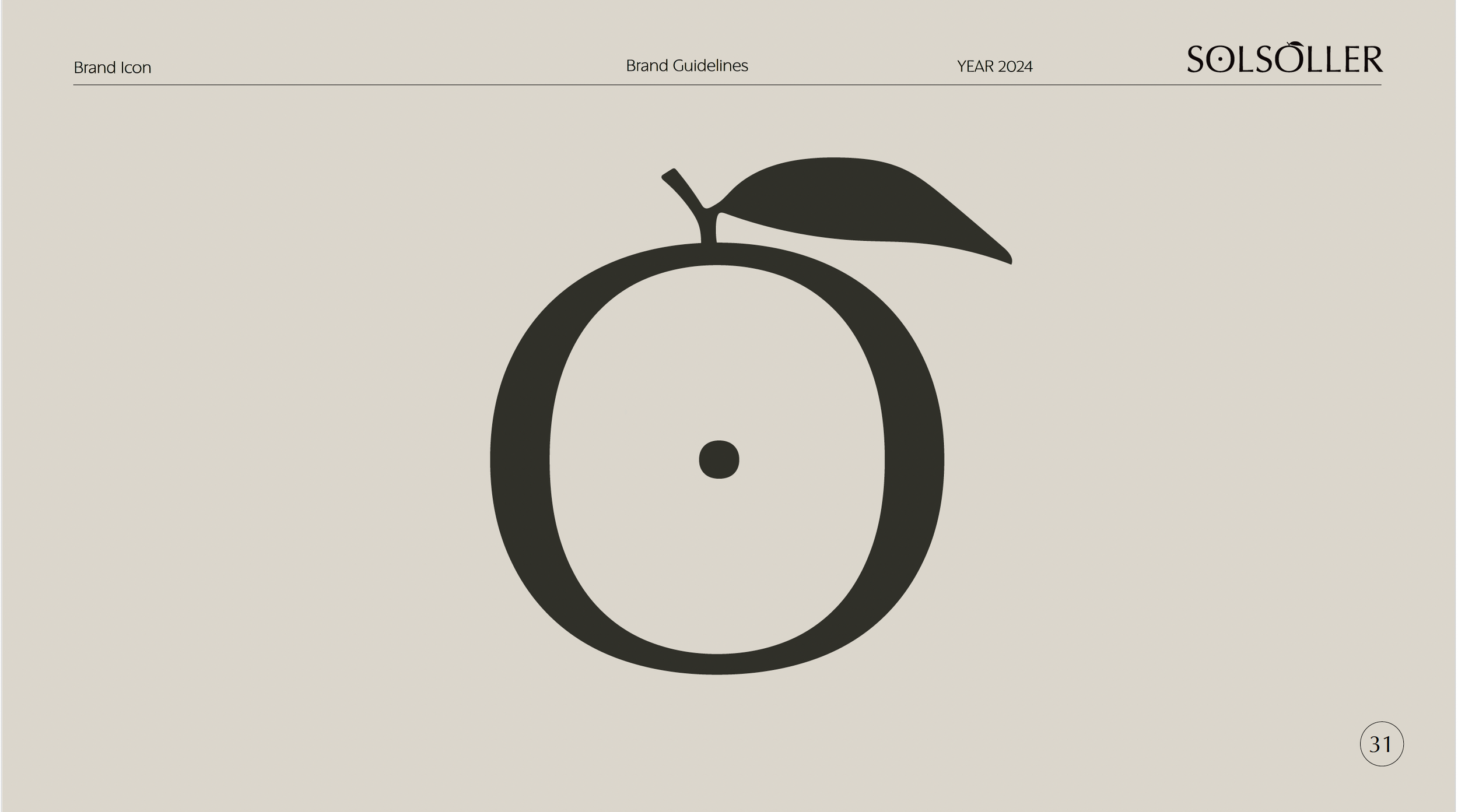
The identity is anchored in a single iconographic gesture. The transformation of the letter “O” within the logotype into a symbolic form that encapsulates the narrative universe of Solsoller.
The conceptual reference for the mandarin shaped “O” was proposed by Daniela Ojeda and building upon this premise, N Studio developed the final logo architecture, refining the symbol and designing its internal structure so that the mark operates as a layered icon rather than a literal representation.
At the center of the symbol, a precise circular core was introduced, conceived simultaneously as the Mediterranean sun and as the pupil of a protective eye. This subtle intervention transforms the mark into a multidimensional sign where geometry and symbolism converge.
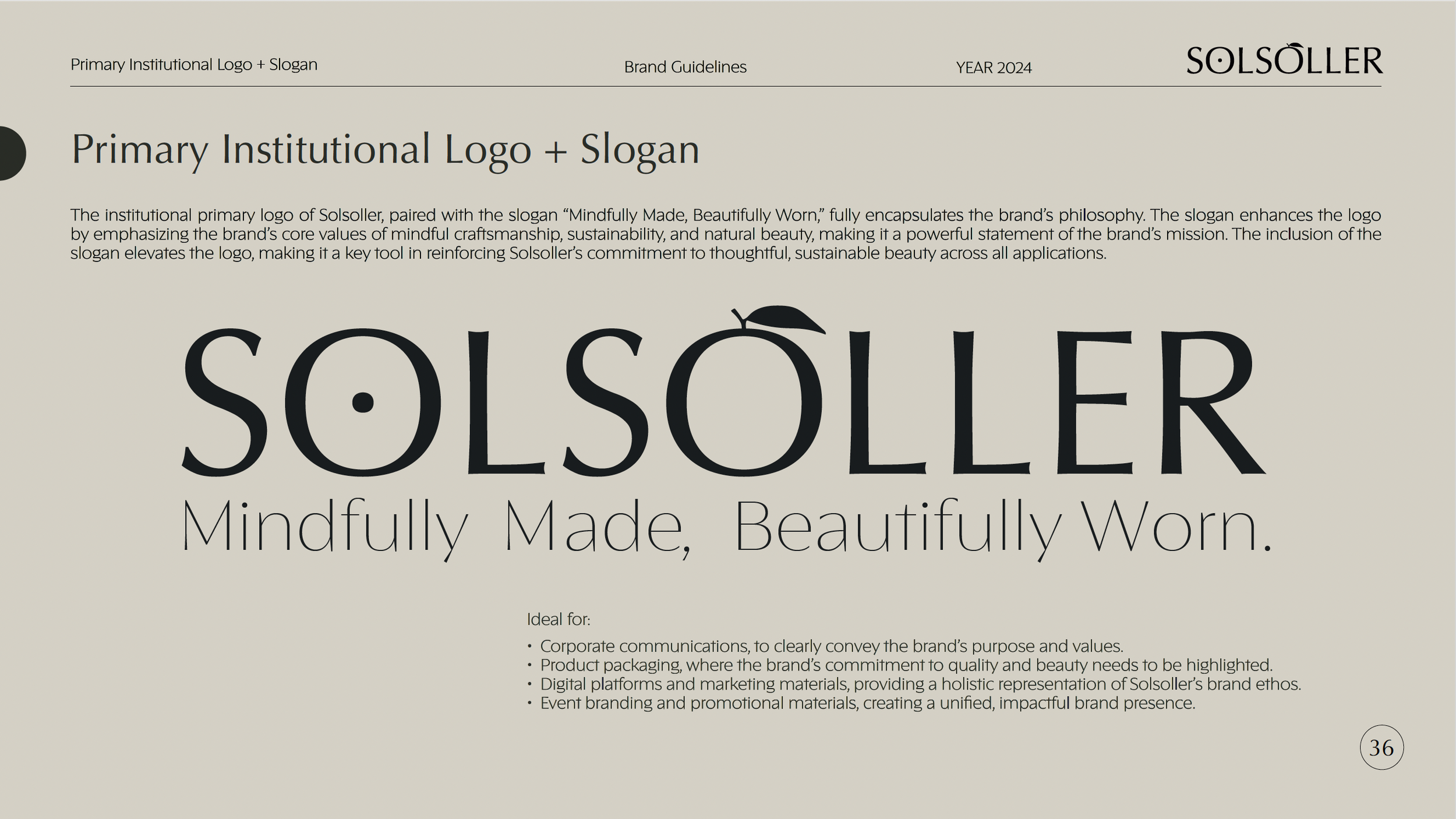
From this idea, N Studio developed a complete visual identity system designed to support the brand across multiple expressions while maintaining conceptual coherence. The system includes a structured typographic architecture, a refined chromatic palette and a modular packaging language capable of accommodating both skincare and makeup collections.
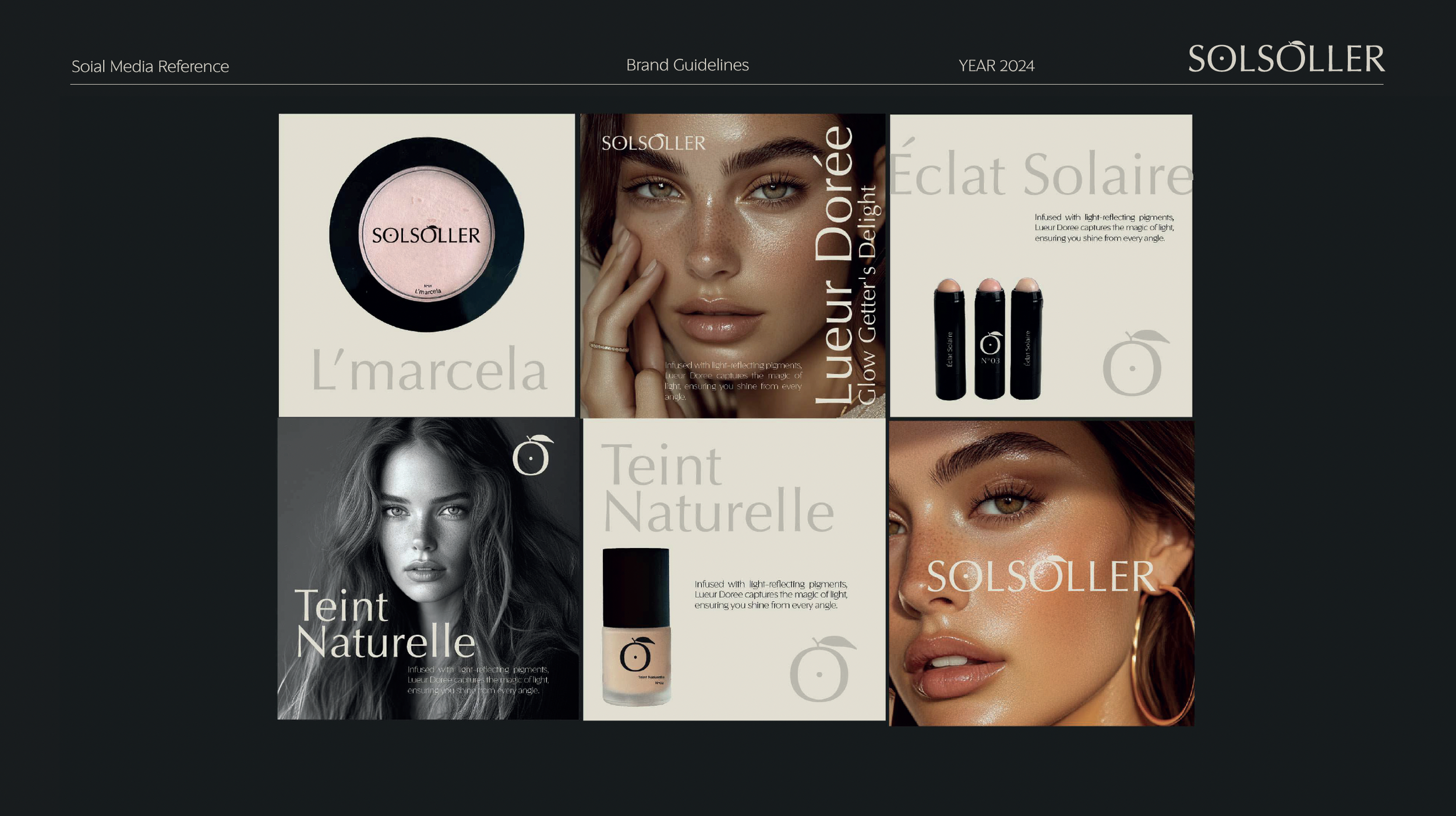
The visual language balances Mediterranean warmth with editorial restraint, allowing the brand to move fluidly between luxury beauty, contemporary skincare and curated product releases.
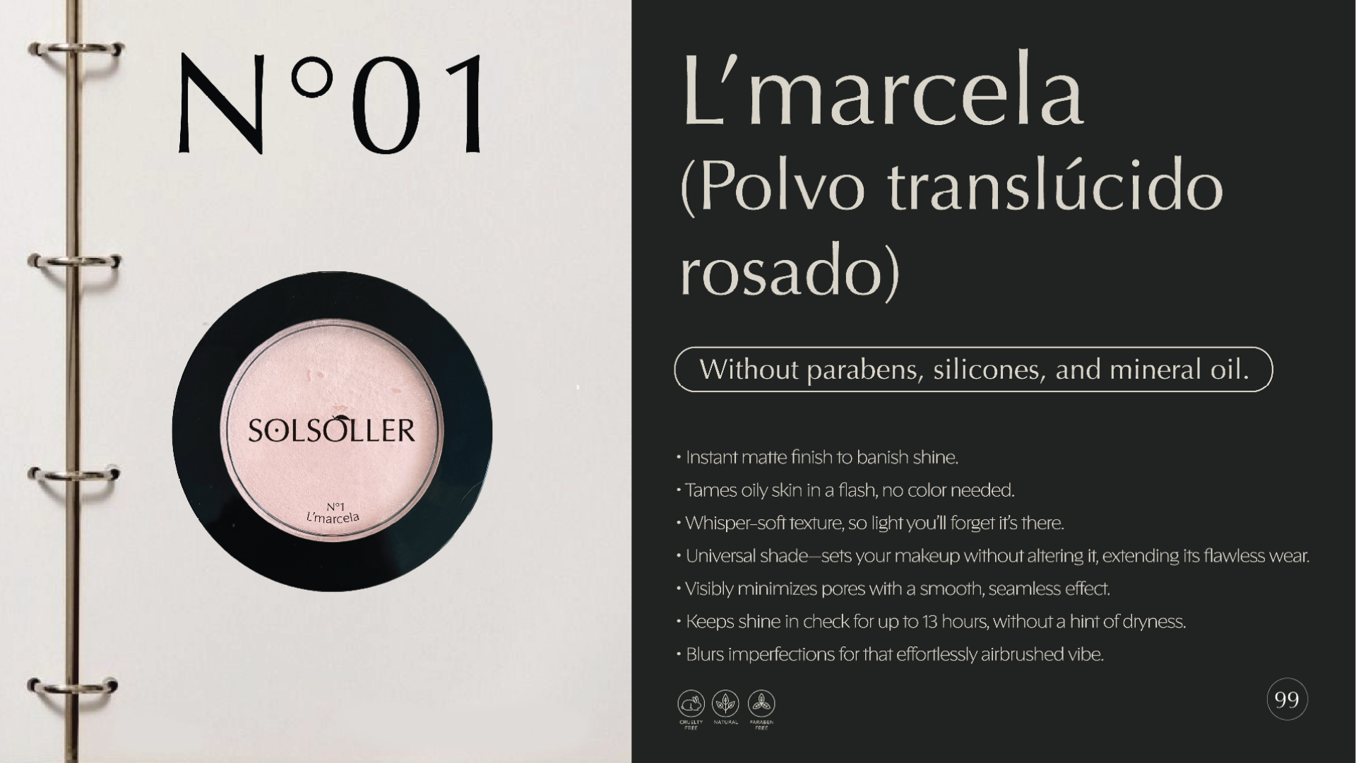
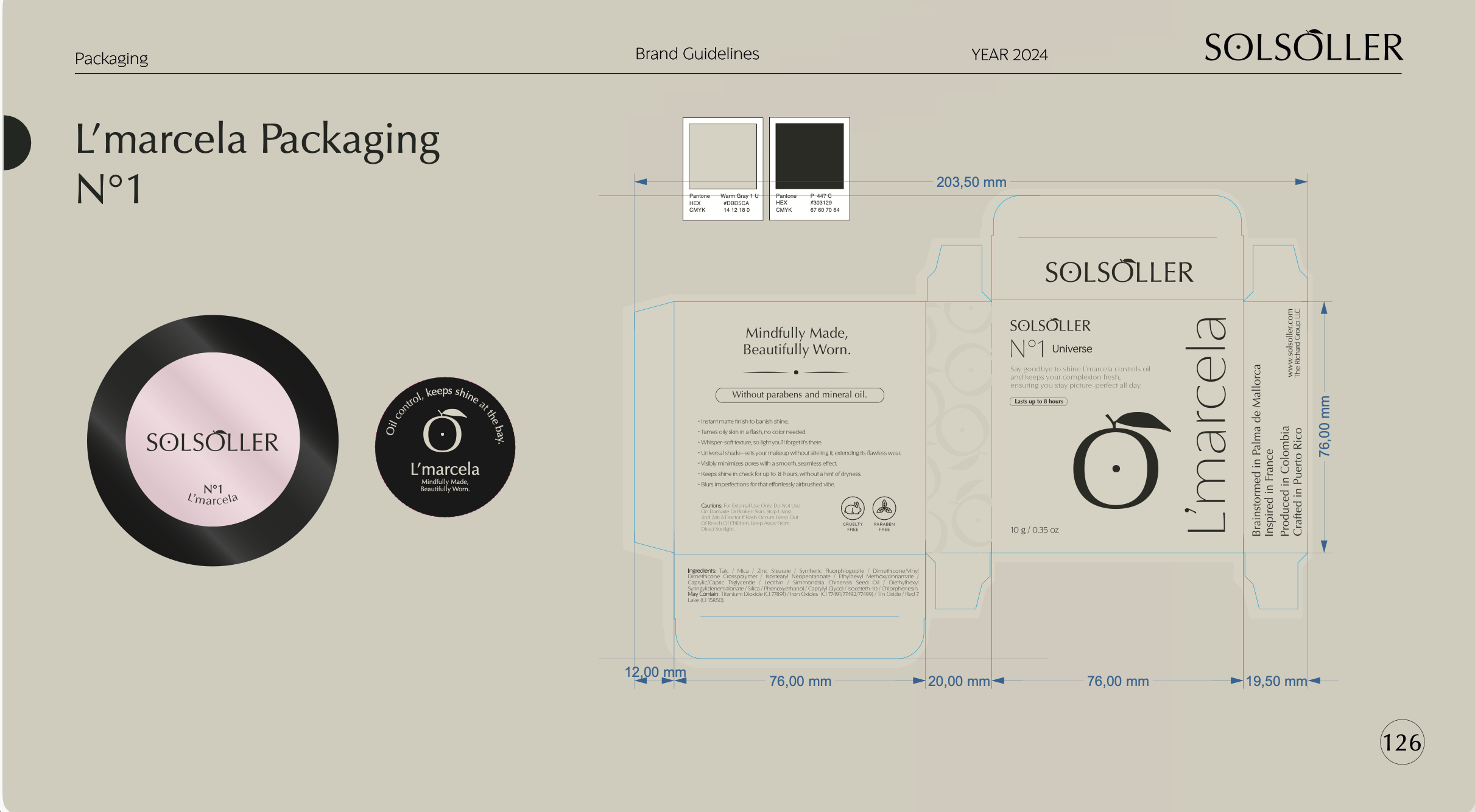
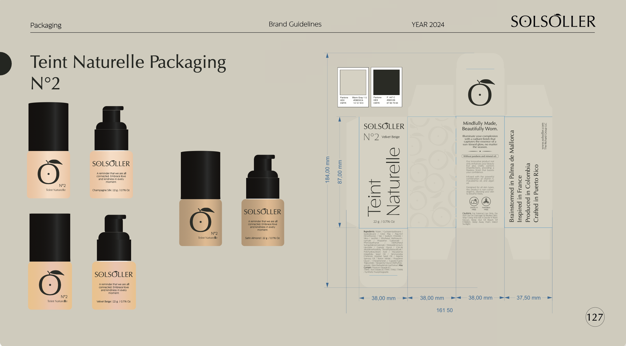
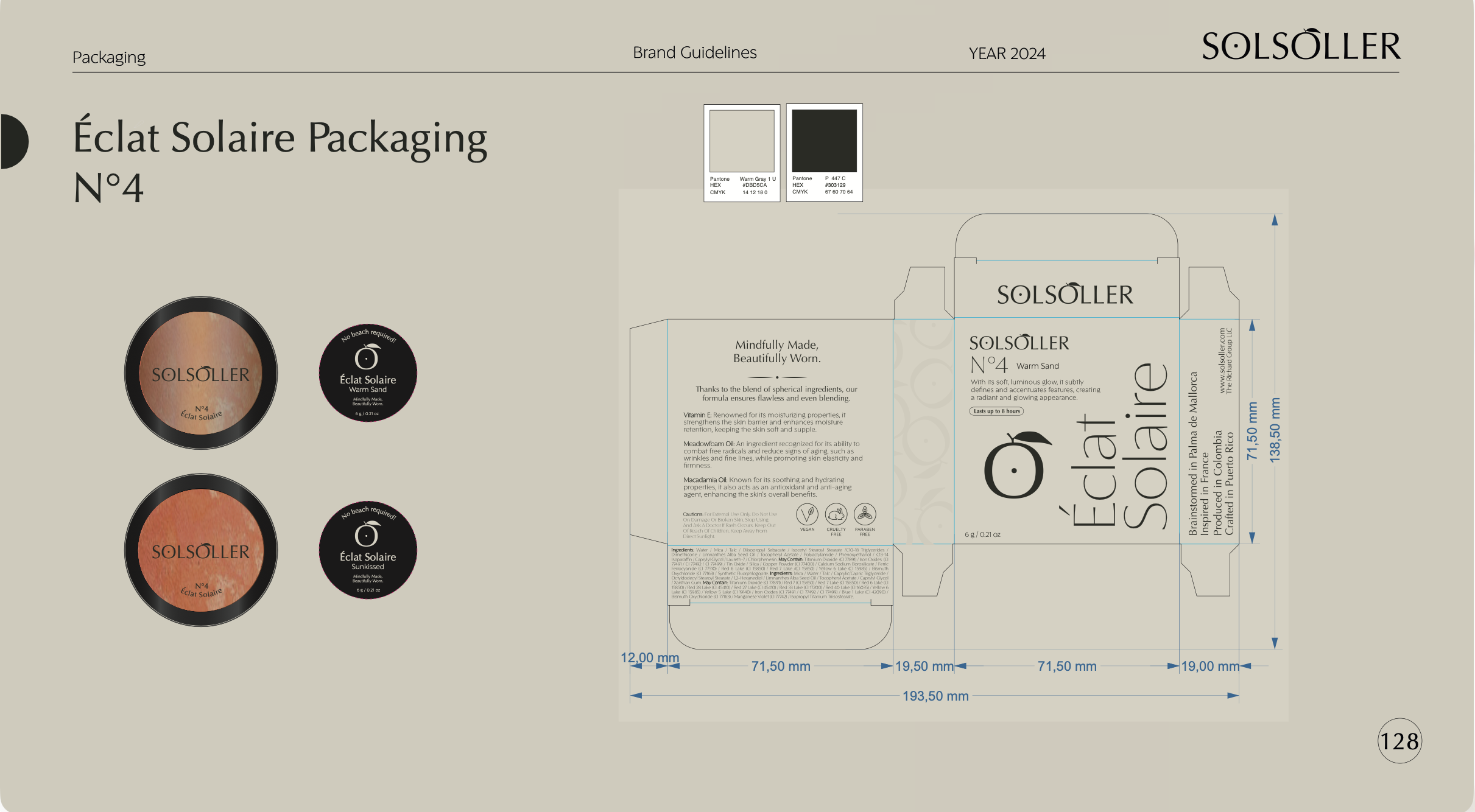
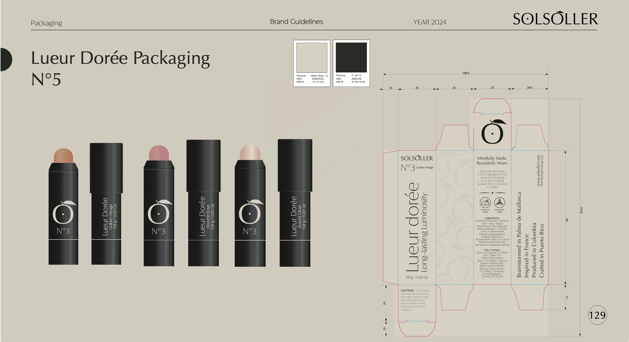
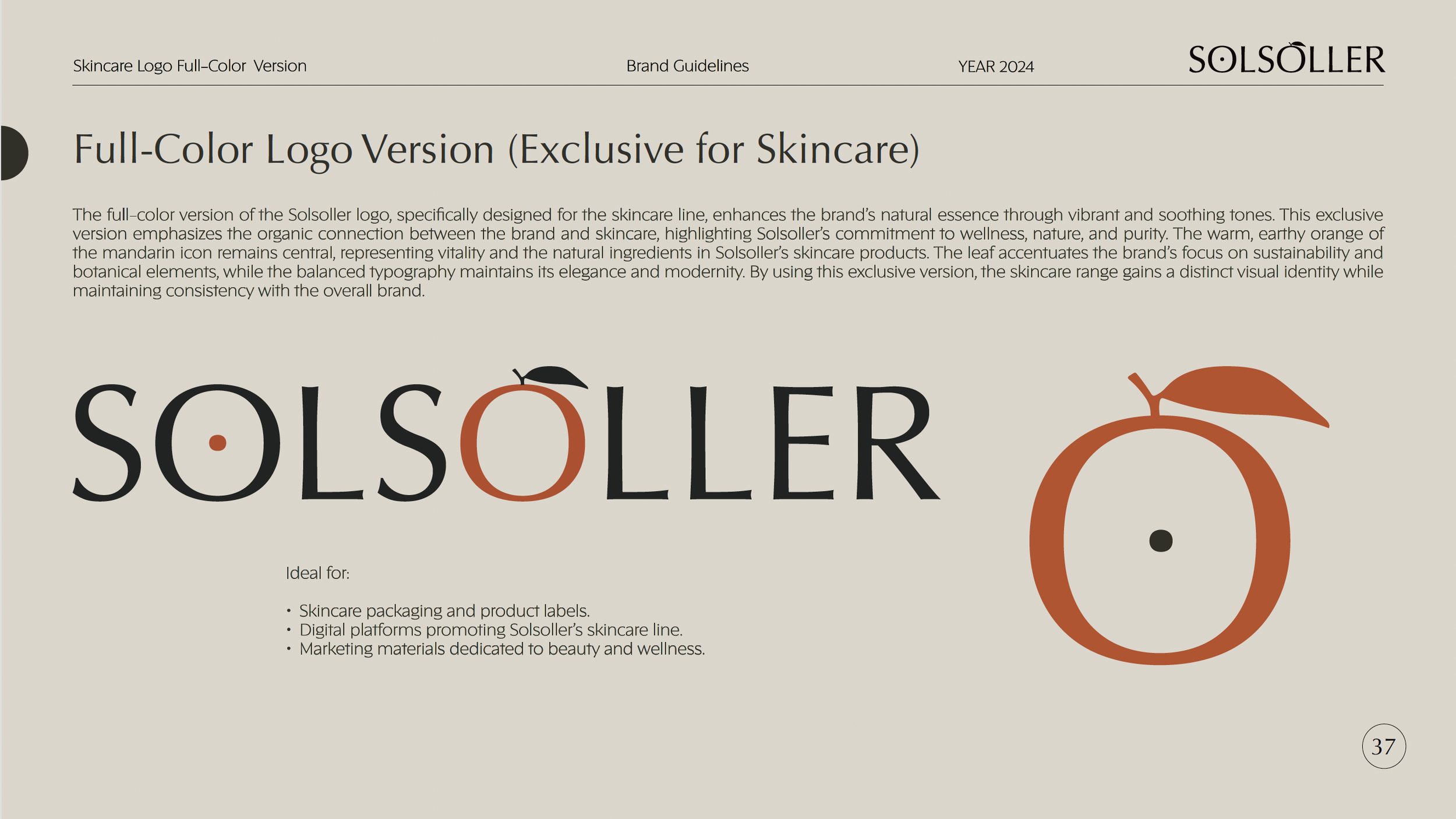
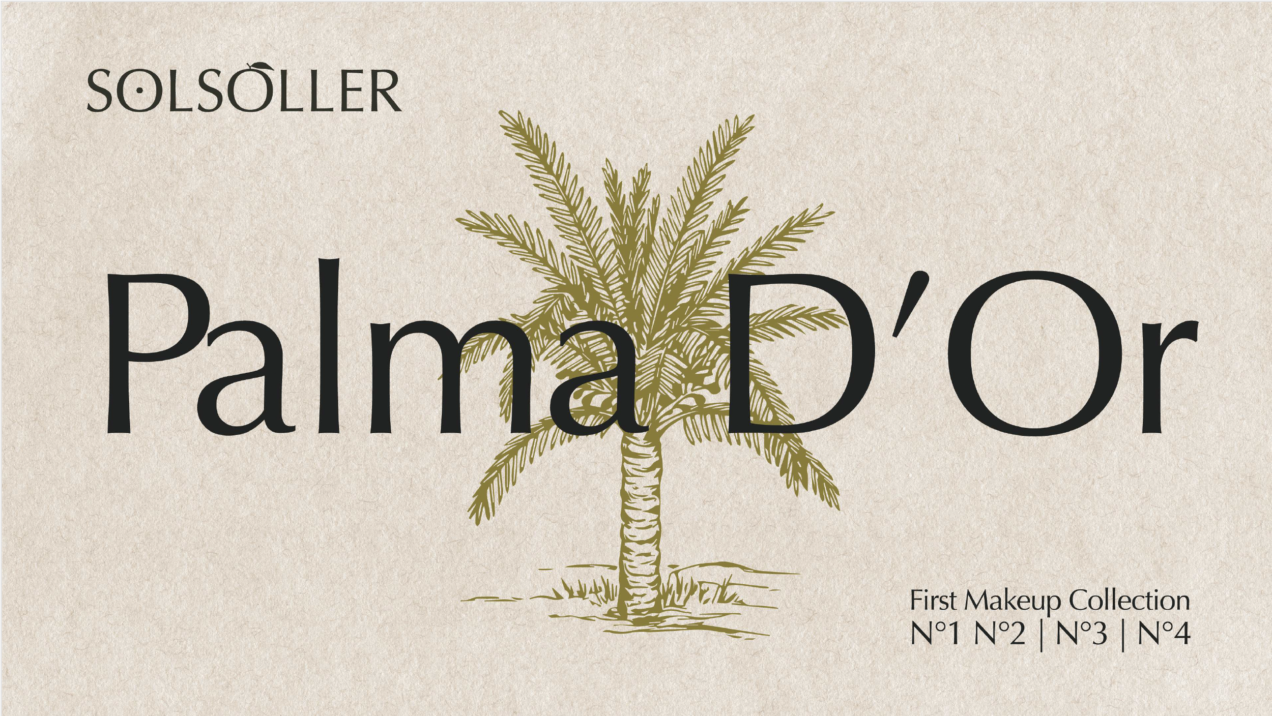
The packaging system was conceived as a natural extension of the brand’s iconographic language. Rather than treating packaging as a secondary application, it was developed as a central component of the identity, translating the symbolic universe of the brand into tactile and visual form.
The design balances editorial restraint with Mediterranean warmth, using carefully calibrated color palettes, typographic hierarchy and minimal compositions to create a refined and recognizable product architecture.
Different chromatic environments were developed to distinguish product categories while maintaining coherence across the brand ecosystem. Subtle variations in tone allow each product line to express its specific character while remaining anchored within the broader identity system.
Agency: N Studio
Year: 2024
Brand Strategy / Logo Design and Iconographic Symbol Development / Visual Identity System / Typography System / Packaging Design / Art Direction / Brand Guidelines Development